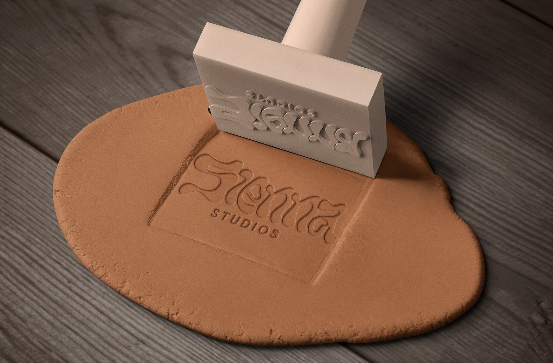
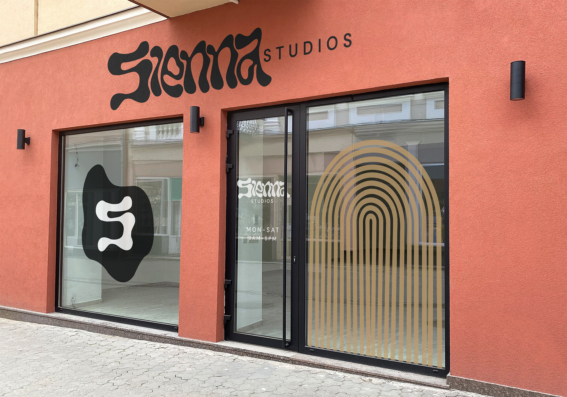
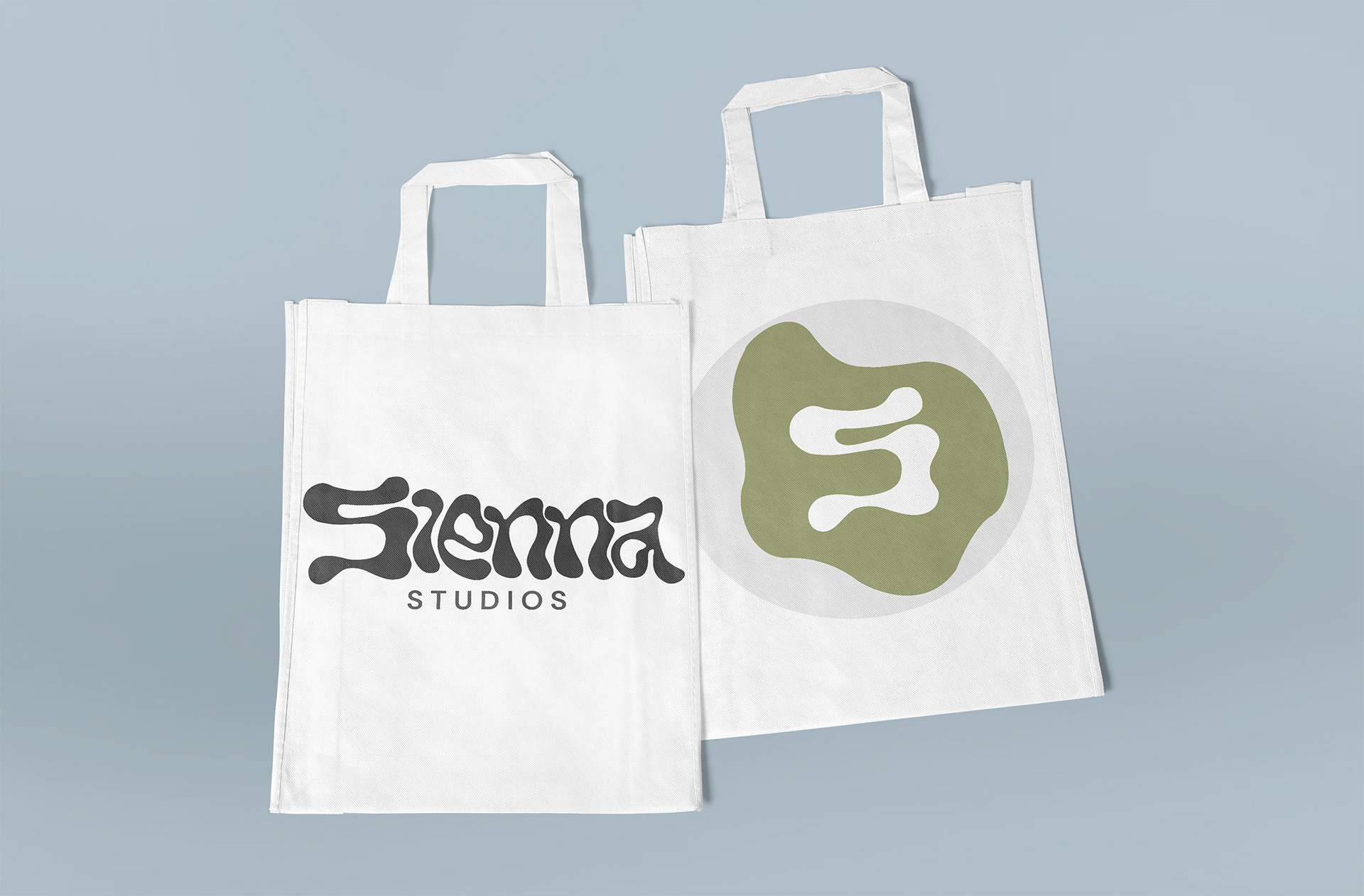
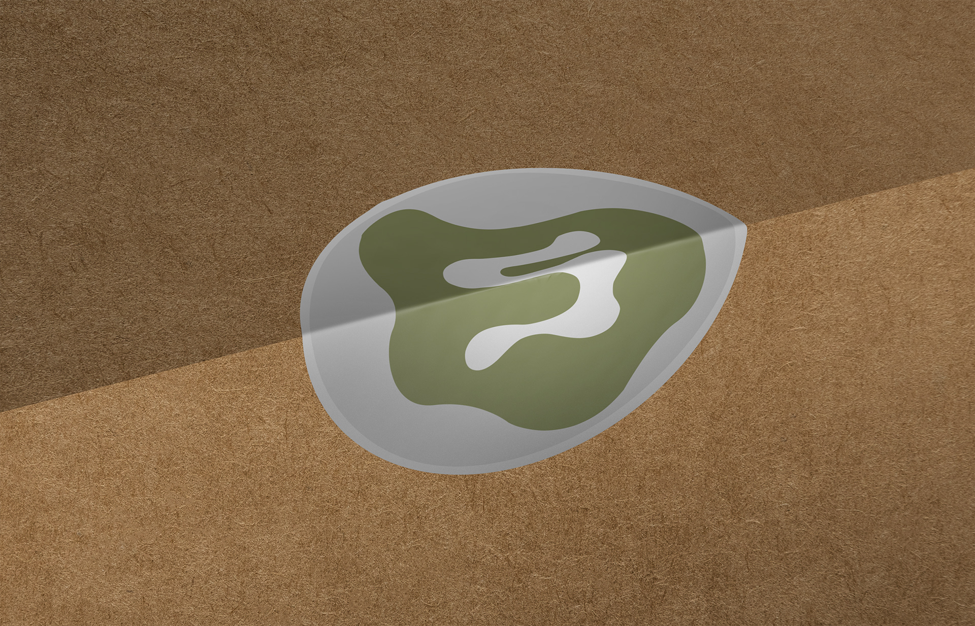
This project was a full rebrand for Sienna Studios. The original logo was minimal and functional, but it did not reflect the true personality or creative direction of the company. My goal was to develop a visual identity that felt more aligned with the studio’s artistic energy and tactile nature.
The new logotype was designed with letterforms that resemble sculpted clay: soft, organic, and slightly imperfect. The positioning and flow of each character were intentionally shaped to feel molded rather than typed. Giving the brand a handcrafted presence. This approach reinforces creativity, material exploration, and the physical process behind the studio’s work.